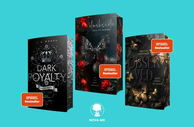
1st book cover: Crime and thriller
Both genres deal with the dark side of society.
In line with this, most book covers of crime and thriller novels are kept in muted colors and create a dark mood. They are very rich in contrast and catch the eye. They provide a brief insight into the suspense and danger that awaits readers in this book.
Color scheme for crime novels and thrillers
The range of colors used in crime novels is very limited. They often focus on one main color and a monochrome color scheme. The most commonly used colors are black, white, red and blue. This choice of color alone creates the necessary mood.
Typeface that creates tension
The title is usually placed in bold, sans serif letters for easy legibility. Sans serif fonts convey strength and solidity. By removing any playfulness in the font, the menace and seriousness of the book is emphasized.
Examples: Bebas Neue, Coolvetica, Directors, Silver Sideshow
Thriller motifs
The motif should be reduced to a central element and not have many details or playful individual elements. The cover should be easy to understand and send a dark, dramatic and threatening message through the motif.
Classic elements are: Blood, destroyed objects, weapons or desolate landscapes.
2nd book cover: romance novels
Romance novels highlight the beautiful sides of life. Even if there may be a dramatic twist in the book, the focus is usually on the pleasant side. This is also conveyed by the cover. The cover creates a cheerful, bright and friendly mood.
Color choice for romance novels
There are no major restrictions on the choice of color for romance novels. Nevertheless, the majority of books use light, friendly and warm pastel shades. Popular colors are pink, turquoise and green.
Romantic fonts
Traditionally, light, playful fonts are chosen for romance novels - whether handwritten, with serifs or without, there are only a few creative limits.
Examples: Rainbow Bitch, Freebooter Script, Jenna Sue, Foglihten
Motifs for romantic books
Motifs range from sketches to collages and photos. While drawn motifs and collages often hide a lot of details that only catch the eye on closer inspection, photos are usually focused on a single motif that reflects the main theme of the book.
The usual themes of the motifs are: Couples, flowers, fruits and cute animals.
3rd book cover: erotic novels
Thematically, there are many parallels between the erotic novel and the romance novel. However, the erotic novel focuses much more on the erotic aspect of the relationship and the physical. Scenes that are only touched on in romance novels are expanded in erotic novels and often take center stage. When designing the cover, care should be taken to ensure that it always radiates elegance and does not appear cheap or obscene.
Color scheme for erotic novels
The color palette for erotic novels is mostly in the purple and blue range, with occasional contrasts of yellow.
Font for titles of erotic novels
The font follows clear lines and looks elegant. A combination of sans serif and serif fonts is not uncommon.
Examples: Edition, Foglihten No06, Caviar Dreams
Motifs for the cover design
The motif of an erotic cover is usually drawn from one of the following three areas: Blossoms, accessories and embracing couples. There is usually a central motif.
Make sure that the motif always exudes a certain class. Sometimes it's better to just hint at something to create interest.
4th book cover: Fantasy novels
Fantasy is a very broad and extensive genre that can overlap with almost any other genre. Authors create new worlds and cultures, new creatures, techniques and laws. The target audience for fantasy novels is similarly broad. The fantasy book cover is often more complex than other genres as it has to represent a whole new world. Here are some tips for designing an appealing fantasy cover
Color choice for the fantasy book cover design
The color palette for fantasy covers ranges across all colors. It is interesting to note, however, that in most cases a main color is chosen that defines the entire cover. Sometimes a signal color is added. Earth tones and greens are a common choice.
Fantasy fonts
The font is usually playful and serifed. Old-fashioned fonts are often used to emphasize the fantastic elements. Just as with themes and color choices, any font can be used in the fantasy genre.
Examples: Augusta, Cardinal, Celi, Fairydust
Motifs for fantasy cover design
Figures, buildings and objects from the story that have been illustrated are often used as motifs. A photograph is rarely chosen. The most common are completely drawn, painting-like covers of symbolic silhouettes.
Readers of fantasy novels are used to drawn covers and photographs stand out strongly. With a suitable photo, however, it can also be your opportunity to attract additional attention.
5. cover design for guidebooks
There are now guidebooks on almost every topic, whether it's parenting, nutrition or professional success. Therefore, the variety of covers is not surprising. Nevertheless, there are some guidelines that you can follow. For example, the cover should always look bright and friendly, the font should be clearly legible and the cover should not be overloaded.
Color choice for guidebooks
The cover of a guidebook is usually very bright and colorful. There is no clear line for the choice of color - it is usual to concentrate on two main colors.
Font
The most important thing about the font in a guidebook is that it is clearly legible and you can see at first glance what it is about. For this reason, sans serif, bold fonts are very popular. However, serif fonts also appear frequently, especially in guidebooks that want to position themselves as more serious.
Example: Headline, Small Slabserif, Get Coffee, Freshman
Cover motifs for guidebooks
The focus should be on an object that fits the topic. If the author is already established, an author portrait may also be the right choice.